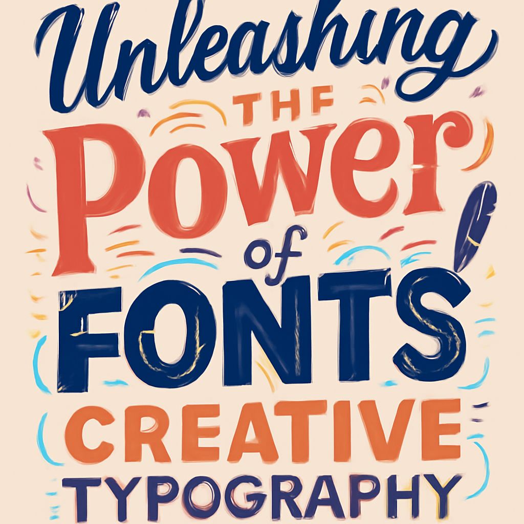
Typography is more than just the art of arranging type; it’s a powerful tool that conveys emotions, establishes brand identity, and enhances user experience. By mastering creative typography, designers can transform ordinary text into captivating visual elements that grab attention and communicate messages effectively. For inspiration, check out these Creative iPhone mockup examples that showcase how fonts can elevate design.
The Art of Typography
Typography is often considered one of the most crucial aspects of design. Its importance spans from setting the tone of a design to enhancing readability. The choice of typeface can significantly influence how a message is perceived by the viewer. Let’s delve into the fundamentals of typography and explore how creative typography can transform your designs.
The Evolution of Typography
Typography is not merely about choosing a stylish font. It involves the deliberate selection of typefaces and arrangement of text to convey a message effectively. This art form dates back to the invention of the printing press and has evolved significantly with digital advancements.
In the early days of typography, movable typefaces allowed for the widespread dissemination of written content, revolutionizing communication. As technology advanced, typography transitioned from being a highly manual process to a more automated one, now integral to digital design and marketing strategies. Designers today have thousands of fonts at their fingertips, allowing for unparalleled creativity and expression.
The Influence of Typography on Design
When thoughtfully employed, typography can direct the viewer’s attention, evoke emotions, and establish a brand’s identity. Here’s how typography impacts design:
- Establishes Hierarchy: By varying font sizes and weights, designers can create a visual hierarchy, guiding the audience through content in a desired sequence. This technique ensures that the most critical information is seen first.
- Conveys Emotion: Different typefaces can evoke unique emotions. For instance, a whimsical script may convey joy or informality, while a clean sans-serif might suggest professionalism. The emotional impact of typefaces can significantly alter the perception of the content’s tone.
- Enhances Readability: Proper spacing and alignment improve readability, ensuring the audience can effortlessly engage with the content. Without good readability, the message may be lost or misinterpreted.
- Creates Visual Harmony: Typography can bring balance to a design. Consistent use of fonts throughout a piece ensures that all elements work together harmoniously, which is crucial for aesthetic appeal.
Typography in Branding
Your brand’s typography should reflect its identity and values. Here are a few ways typography is used in branding:
- Logo Design: The choice of font in a logo is critical as it becomes synonymous with your brand. A distinctive typeface can make your logo more memorable and easily identifiable, reinforcing brand recognition.
- Consistent Brand Voice: Using a consistent typographic style across all branding materials helps establish a cohesive brand voice, making your brand easily recognizable. This consistency builds trust and familiarity with your audience.
- Emotional Connection: Typography plays a significant role in creating an emotional connection with your audience, impacting how your brand is perceived. The right typeface can evoke the desired emotional response and reinforce your brand’s narrative.
- Differentiate from Competitors: Unique typography can set your brand apart in a crowded market, offering a competitive edge by being distinctly associated with your business values and identity.
Designing for the Digital Age
In today’s digital world, typography also plays an essential role in web and app design. Responsive designs require typographic choices that look good across all devices and screen sizes. Designers must consider aspects such as font loading times and readability on smaller screens.
Moreover, accessibility concerns mean that typography must cater to a wide audience, including those with visual impairments. Techniques like choosing high contrast fonts and providing alternatives for screen readers significantly include user experience and extend brand reach.
Practical Tips for Better Typography
Here are some practical tips to help you harness the full potential of typography in your designs:
1. Start with the Purpose
Before selecting a typeface, clearly define the purpose of your design. Understand what you want to communicate and the emotions you wish to evoke. Choosing a typeface aligned with your design’s purpose will ensure a stronger connection with the audience.
2. Keep the Audience in Mind
Consider who will view your design. Different demographics may respond differently to specific typefaces, so it’s essential to choose a font that resonates with your target audience. For instance, a younger audience might appreciate more modern and bold typefaces, while an older demographic may prefer classic and traditional fonts.
3. Balance Contrast and Consistency
Striking the right balance between contrast and consistency in typography helps emphasize the information hierarchy and make your design more engaging. Use varied font weights and styles to create the necessary contrast while maintaining consistency in key design elements to preserve a unified look.
4. Don’t Overuse Fonts
While it can be tempting to use multiple fonts to inject creativity into a design, over-complication can lead to visual clutter. Limiting the design to two or three complementary typefaces will enhance clarity and maintain a professional appearance.
FAQ
What is the difference between a font and a typeface?
A typeface, often referred to as a type family, is a collection of fonts that share a common design ethos. A font is a specific weight or style within that family. For instance, Arial is a typeface, while Arial Bold and Arial Italic are fonts within that typeface.
How do I choose the best font for my design?
Consider the message you want to convey, your audience, and the medium of delivery. Ensure the font complements your content and aligns with your overall design goals. Testing multiple options can also help you choose the most effective typeface.
Use online resources and tools like font pairing websites to see how different typefaces work together. Don’t forget to gather feedback from peers or focus groups to gauge the effectiveness of your typographic choices.
Can I use multiple typefaces in a single design?
Yes, using different typefaces can add visual interest, but it’s essential to maintain balance and cohesion. A general rule is to use no more than two to three typefaces to avoid a cluttered design. Ensure that the typefaces harmonize and don’t clash, maintaining visual harmony across the elements.
In conclusion, typography is an incredibly powerful tool in the designer’s toolkit. By understanding its principles and recognizing its impact, you can create designs that resonate well with audiences, convey the intended message clearly, and effectively accomplish their purpose.


