Introduction
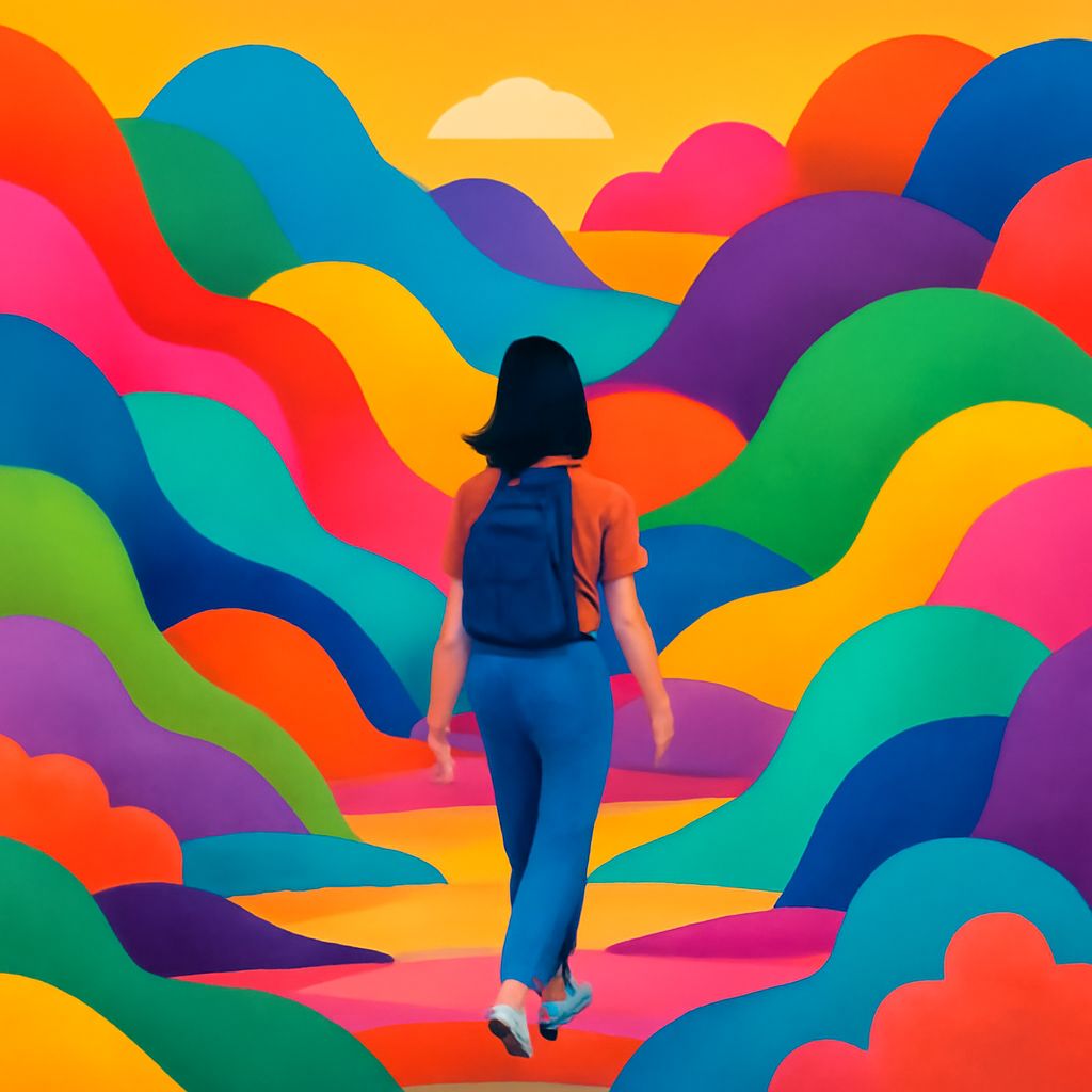
Color is a powerful tool in the world of design and art. It influences emotions, thoughts, and decision-making processes. Whether you are creating a brand identity, designing a website, or planning an outfit, understanding vibrant color combinations can transform your work from ordinary to extraordinary.
In the realm of design, vibrant color combinations can breathe life into any project, creating a visual impact that captivates viewers. When exploring themes for products like dropper bottles, understanding how colors interact not only enhances aesthetics but also communicates brand identity effectively. Discover tools like editable dropper bottle templates that allow you to experiment with these dynamic palettes.
The Psychology of Color
Color psychology studies how different hues affect human behavior and perception. Vibrant colors can uplift moods, grab attention, and communicate various messages.
- Red: Often associated with passion, urgency, and excitement.
- Blue: Linked to calmness, trust, and stability.
- Yellow: Represents happiness, warmth, and inspiration.
When used strategically, these colors can enhance your design’s effectiveness.
Designing with Bold Color Combinations
Vibrant color combinations are used to create dynamic and eye-catching designs. They can be seen in digital art, advertisements, and packaging where the goal is to stand out.
- Complementary Colors: Combine hues from opposite sides of the color wheel for high contrast.
- Analogous Colors: Use colors next to each other on the color wheel for a harmonious look.
- Triadic Colors: Select three evenly spaced colors for dynamic designs.
| Combination | Usage | Effect |
|---|---|---|
| Red & Green | Holiday themes, energetic designs | High contrast |
| Blue & Orange | Modern websites, sports branding | Vibrant and bold |
| Purple & Yellow | Fashion, artistic posters | Striking and creative |
Applications in Fashion and Branding
Color combinations in fashion can define trends and influence consumer behavior. Designers use vibrant palettes to invoke specific styles or themes.
Brands often select color combinations that align with their identity and values. For instance, eco-friendly brands may opt for green hues, while luxury brands might choose platinum colors.
FAQ
How do I choose the right color combination for my project?
Consider the message you want to convey, your audience’s preferences, and the context of use. Color wheels and inspiration galleries can be helpful tools.
What tools can help in creating vibrant color palettes?
Tools like Adobe Color, Coolors, and Canva allow you to experiment with different combinations and see their impacts in real-time.
Can vibrant colors be used for professional settings?
Absolutely. The key is using vibrant colors sparingly and in the right context to maintain professionalism while capturing attention.
Do vibrant colors affect user experience?
Yes, vibrant colors can enhance user experience by making interfaces more engaging and legible when used correctly.
Are there cultural considerations in color usage?
Certain colors may hold different meanings in varied cultures. Research your audience thoroughly to avoid misinterpretation.
Conclusion
Embracing vibrant color combinations can elevate your designs, making them more impactful and memorable. Whether you are working in digital arts, fashion, or branding, these combinations guide viewers’ emotions and perceptions. Remember, knowing your audience and context will help you choose and implement colors effectively, ensuring your projects remain timeless and appealing.


