Unlock Your Creativity: 10 Inspiring Color Palette Ideas
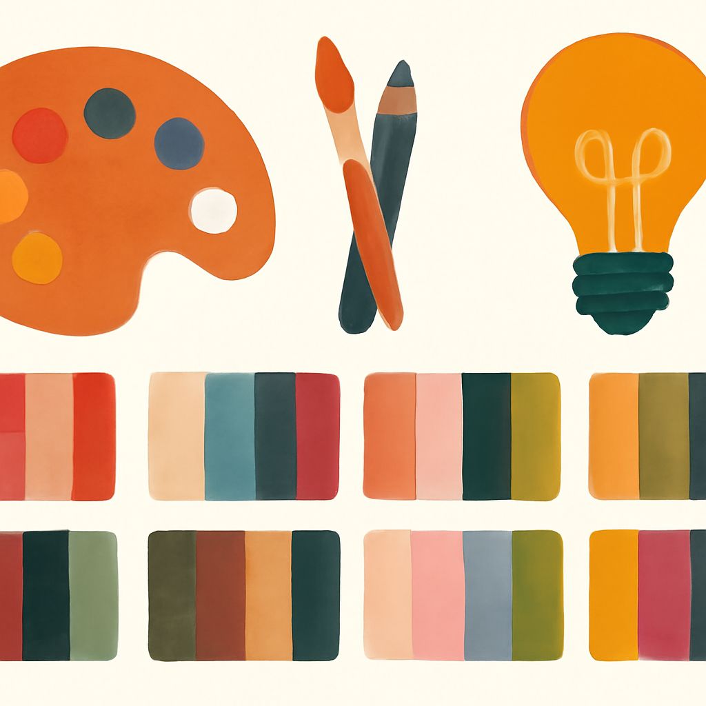
Color is a powerful tool in the creative toolbox. It can evoke emotions, convey messages, and bring life to any project, whether it’s graphic design, interior decorating, or art. With the right color palette, you can transform an ordinary work into something extraordinary. Here, we explore ten inspiring color palette ideas that can help unlock your creativity and give your projects the edge they need.
Unlocking your creativity can be as simple as exploring inspiring color palettes. By incorporating thoughtfully chosen colors, you can breathe life into your designs, making them more appealing and impactful. For some practical applications, check out these menu template examples that illustrate how color can transform any project.
1. Vintage Nostalgia
The vintage nostalgia color palette is all about evoking the warmth and charm of bygone eras. Think muted pinks, sage greens, and deep burgundies. These colors often remind us of old photographs or vintage fashion, making them perfect for projects that require a touch of classic elegance.
Use this palette in:
- Wedding invitations
- Old-school branding projects
- Interior design with a retro vibe
2. Tropical Paradise
Dive into the vibrant world of a tropical paradise with colors that are as energizing as they are exotic. Bright corals, lush greens, and ocean blues dominate this palette, conjuring images of sun-soaked beaches and clear blue waters.
Best for:
- Summer event posters
- Beach-themed websites
- Vacation brochures
3. Minimalist Monochrome
For those who prefer a more pared-down aesthetic, the minimalist monochrome palette offers simplicity with sophistication. Black, white, and varying shades of grey can create stunning visuals without the need for multiple colors.
Perfect applications:
- Modern magazine layouts
- Architectural designs
- High-fashion photography
4. Earthy Tones
Earthy tones bring a sense of comfort and grounding to any project. Inspired by nature, this palette includes warm browns, dusty ochres, and deep forest greens.
Ideal for:
- Eco-friendly product packaging
- Natural skincare branding
- Organic food advertising
5. Pastel Dreams
Soft and sweet, pastel dreams offer colors that are calming and delightful. Light pinks, baby blues, and gentle lavenders make up this palette, perfect for creating soothing and playful designs.
Use in:
- Children’s book illustrations
- Spring collection fashion lines
- Nursery decor
6. Bold and Bright
This palette is not for the faint-hearted. Combining vivid yellows, electric blues, and hot pinks can result in eye-popping designs that command attention.
Best suited for:
- Pop art projects
- Sporting event marketing
- Youth-oriented product launches
7. Muted Neutrals
Muted neutrals are all about subtle sophistication. This palette includes soft greys, taupes, and washed-out beiges, ideal for creating a calm and elegant aesthetic.
Top uses:
- Luxury brand identity
- High-end hospitality interiors
- Fine dining menu design
8. Jewel Tones
The opulence of jewel tones can add rich vibrancy to any creative project. Deep emeralds, royal blues, and ruby reds are perfect for creating a sense of luxury and sophistication.
Great for:
- Evening wear fashion
- Majestic interior design
- Luxury product branding
9. Urban Industrial
Inspired by the rawness of urban landscapes, the urban industrial palette often features steel greys, rusty reds, and concrete whites. This palette is perfect for conveying a modern, edgy feel.
Applicable in:
- City-themed art installations
- Loft apartment interiors
- Tech product branding
10. Celestial Wonders
Take inspiration from the cosmos with a celestial wonders palette. Midnight blues, starry whites, and nebula-inspired purples can create otherworldly designs that intrigue and enchant.
Perfect for:
- Sci-fi book covers
- Astronomy-themed exhibitions
- Futuristic interface designs
Conclusion
Exploring different color palettes is an excellent way to fuel your creativity and bring new life to your projects. Whether you’re looking to evoke nostalgia, convey luxury, or add a pop of color, there’s a palette for you. Don’t be afraid to experiment with these ideas, mix them up, and create your own unique combinations. The right colors can make your projects unforgettable.
FAQ
What are color palettes?
Color palettes are a range of colors selected to create a specific look or feel in design projects, ensuring a harmonious and aesthetically pleasing outcome.
How can color palettes enhance creativity?
Color palettes can inspire creativity by providing a structured selection of colors that evoke specific emotions, set moods, and communicate ideas effectively.
Why is it important to use color palettes in design?
Using color palettes in design is important because they help maintain consistency, enhance visual appeal, and convey the intended message or mood to the audience.
What are some popular color palette trends for 2023?
Popular color palette trends for 2023 include earthy tones, vibrant neons, muted pastels, and monochromatic schemes, reflecting a balance between boldness and subtlety.
How do I choose the right color palette for my project?
To choose the right color palette, consider your project’s mood, target audience, and the emotions you want to evoke, while also factoring in current trends and personal preferences.
Can I create my own color palette?
Yes, you can create your own color palette by experimenting with different color combinations, using online tools, and drawing inspiration from natural or cultural sources.


