Introduction to Logo Creation
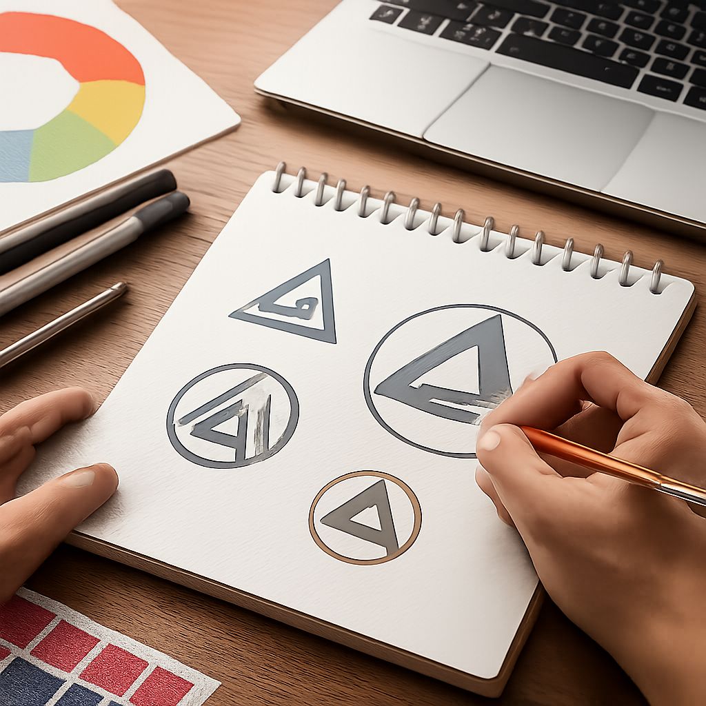
Crafting a logo is more than just creating a visual element; it’s about capturing the essence of a brand in a single motif. A logo serves as the face of a brand, representing its values, mission, and uniqueness. In today’s competitive market, mastering the art of logo creation is crucial for any designer aiming to leave a lasting impact.
Understanding the nuances of logo design requires a blend of creativity, strategic thinking, and awareness of emerging trends. As tastes and technologies evolve, designers must constantly update their skills and approaches to stay relevant. This article delves into key tips and trends that can guide designers towards creating iconic logos. Beyond mere representation, a logo acts as a powerful branding tool, helping to establish a connection between the brand and its target audience.
Essential Logo Design Tips
Creating an effective logo involves several steps:
- Simplicity: A simple logo is easily recognizable and more memorable. Avoid clutter and aim for a clean design. The best logos often make a strong first impression, leaving a lasting impact with minimal elements.
- Relevance: The design should resonate with the brand’s identity and target audience. Research and understand the brand story before starting. This involves delving into the brand’s core objectives, its market positioning, and the demographics it aims to attract.
- Versatility: Ensure the logo looks good on various mediums – from business cards to billboards. A versatile logo adapts to different sizes and formats without losing its impact. This adaptability also extends to digital platforms, where logos may appear as social media avatars, website headers, and in app interfaces.
- Timelessness: Aim for a design that maintains its allure through changing trends. A timeless logo ensures longevity, making rebranding less frequent.
Feedback is an important part of the logo design process. Engaging stakeholders, potential customers, and fellow designers can provide fresh perspectives and insights. Embrace this feedback to refine your design further. Remember, the best logos thrive on continuous iteration before unveiling the final masterpiece.
More Tips for Designing an Effective Logo
Incorporating balance, proportion, and alignment in your design enhances visual harmony and structure. Consider how each element fits together—the space around and within elements is just as vital as the elements themselves. Additionally, using active designs with dynamic shapes and lines can foster a sense of movement and growth, capturing attention amidst competing visual stimuli.
Consider scalability and legibility as paramount. A logo should be equally impactful whether it appears on a giant billboard or a small mobile screen. Adapting to various viewing conditions without losing clarity is essential.
Trends in Logo Design
Keeping up with trends is important yet challenging. Here are some current trends dominating the logo design landscape:
- Minimalism: Stripping designs to their essential elements allows for sharper communication of brand values. Minimalist logos often boast simplicity, clarity, and a pronounced elegance, catering to modern aesthetic tastes.
- Responsive Logos: With multiple screen sizes and devices, adaptable logos that change according to the platform are gaining popularity. This trend embraces responsive design principles, allowing a logo to resize or even reformat based on its screen size or viewing method.
- Hand-Drawn Elements: Incorporating hand-drawn elements can add warmth and personality, making digital brands feel more approachable. These elements often communicate craftsmanship and authenticity, especially appealing to brands focusing on artisanal or unique offerings.
- Vintage Aesthetics: Nostalgia can be a powerful connection tool. Vintage logos often draw inspiration from retro typography and color schemes, appealing to businesses wanting a touch of heritage or a nod to tradition.
While trends provide inspiration, it’s crucial to align them with the core values of the brand you’re designing for. A trend should enhance, not overshadow, the brand’s message. Staying true to the brand’s identity ensures authenticity and strengthens its positioning within its market segment.
The Role of Color in Logo Design
Color selection in logo design is not merely about aesthetic choice—it’s about psychological impact. Each color can evoke specific emotions and perceptions. For instance, red often signifies passion and urgency, blue conveys trust and professionalism, and green suggests health and peace. Understanding the demographics of the target audience can guide proper color choices that align with cultural associations and market expectations.
Moreover, a logo’s color palette should ensure visibility and impact in different environments. Whether in print, on screens, or in embossment, colors must maintain their vibrancy and clarity. Experimenting with contrasts and harmonies can lead to exciting and appealing color schemes.
Typography’s Influence in Logo Design
Typography is a silent yet powerful determinant of a logo’s narrative. Careful font selection can echo the brand’s tone—be it modern, traditional, playful, or serious. Serif fonts might instill a classical, trustworthy feel, while sans-serif fonts project modernity and simplicity.
Custom typography is another avenue for establishing a distinct brand identity. By custom designing a typeface or modifying existing ones, logos can achieve a signature uniqueness that stands apart from competitors.
FAQ
What are the key elements of a successful logo?
A successful logo integrates simplicity, relevance, and memorability. It should be adaptable across various platforms and resonate well with the brand’s audience. Additionally, a successful logo maintains versatility and scalability, ensuring excellence in every setting.
How important is color in logo design?
Color is a powerful tool in logo design. It can evoke emotions and perceptions about a brand. Choosing the right color palette is crucial for aligning with the brand’s message and impacting target audiences. A well-chosen palette supports the brand’s narrative and draws the audience into its story.
How do I choose the right font for a logo?
Select a font that reflects the brand’s personality. The typeface should be legible and complement the logo design. Consider custom typography for a unique brand identity. The right font not only complements visual design but reinforces the message and values conveyed by the logo.
Can a logo be too simple?
While simplicity is key, it should not compromise the meaning and identity of the brand. A logo should be simple yet effectively convey the essence of the brand. Balancing simplicity with depth ensures each element serves a purpose, contributing to a cohesive and meaningful design.


