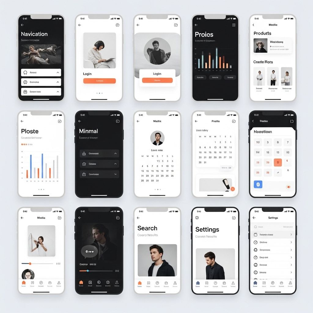
In the realm of web and app design, minimalism has emerged as a powerful aesthetic and functional approach. It strips away the unnecessary, allowing the core elements of a design to shine through. This philosophy not only helps in creating visually appealing interfaces but also enhances user experience by promoting clarity and focus. In this article, we will explore ten remarkable examples of minimal UI design that are bound to inspire designers and developers alike.
In the ever-evolving world of digital design, minimal UI aesthetics continue to capture attention for their clarity and elegance. This article explores 10 minimal UI design examples that not only streamline user experience but also inspire creativity across platforms, including engaging Instagram posts. Discover how simplicity can lead to powerful visual communication.
Understanding Minimal UI Design
Minimal UI design is centered around the concept of simplification. It emphasizes:
- Clean Lines: Straightforward and uncluttered interface components.
- Simple Color Schemes: Limited and harmonious color palettes.
- Essential Elements: Focus on functionality by using only what is necessary.
- Whitespace: Intelligent use of space to create balance and focus.
This approach not only improves aesthetic appeal but also enhances usability by guiding users through a frictionless interaction experience.
1. Apple’s iOS Interface
Apple has long been a leader in minimal design. The iOS interface exemplifies how minimalism can enhance usability:
- Use of simple icons and a limited color palette.
- Clear typography for readability.
- Whitespace that guides user navigation seamlessly.
Key Features
| Feature | Description |
|---|---|
| Iconography | Simple and recognizable icons that convey meaning intuitively. |
| Typography | Clean font choices that enhance legibility. |
| Navigation | Straightforward navigation structure making it easy to use. |
2. Google’s Material Design
Material Design takes minimalism a step further by incorporating depth and motion:
- Layers of information through shadows and elevation.
- Simplified components for user interface elements.
- Responsive layouts that adapt to various screen sizes.
Design Principles
- Material Metaphor: Real-world interactions translated into digital.
- Bold, graphic, intentional: A strong visual hierarchy.
- Motion provides meaning: Animated transitions enhance user feedback.
3. Airbnb’s Website
Airbnb utilizes a minimal design aesthetic to enhance its user experience:
- Large, impactful visuals that draw attention.
- Simplistic navigation features that prioritize functionality.
- Clear call-to-action buttons that guide users smoothly.
4. Dropbox’s Landing Page
Dropbox’s landing page is a classic example of minimal UI that allows users to focus on the primary message:
- Use of ample whitespace allowing content to breathe.
- Bold, straightforward language that communicates value.
- Minimal distractions leading users to sign up.
5. Slack’s User Interface
Slack’s UI design emphasizes clarity and usability, keeping the focus on communication:
- Clear layout with organized conversation threads.
- Subtle color accents to differentiate sections without overwhelming.
- Intuitive icons alongside text for ease of use.
6. Instagram’s Feed
Instagram showcases minimal UI through its focus on content:
- Images and videos take center stage with minimal text.
- Simple navigation for seamless browsing.
- Subtle color schemes that let the content shine.
7. Evernote’s Application
Evernote’s design promotes productivity through a minimalistic approach:
- Clear organization of notes and tasks.
- Essential features available without clutter.
- Simple navigation enhances the user experience.
8. Spotify’s Music Player
Spotify’s interface is designed to keep users engaged with music, utilizing minimal elements:
- Crisp and clear album artwork on a dark background.
- Simple controls for play, pause, and volume.
- Intuitive layout for easy navigation through playlists.
9. Notion’s Workspace
Notion combines minimal design with powerful functionality:
- Clean workspace that avoids distractions.
- Customizable layouts that let users focus on their tasks.
- Simplistic design elements that enhance usability.
10. ZenKit’s Project Management Tool
ZenKit’s minimal design focuses on project clarity and ease of use:
- Simple task management features.
- Clear visual hierarchy to prioritize tasks.
- Intuitive interface for smooth navigation.
Conclusion
Minimal UI design is not just a trend; it’s a philosophy that emphasizes clarity, usability, and aesthetics. The examples discussed in this article illustrate how effective minimalism can be in enhancing user experience across various platforms. As designers continue to explore new ways to create engaging interfaces, the principles of minimalism will undoubtedly continue to inspire and guide the way.
FAQ
What is minimal UI design?
Minimal UI design focuses on simplicity and clarity, using minimal elements to create a clean and user-friendly interface.
Why is minimal UI design effective?
Minimal UI design reduces clutter, enhances user experience, and allows users to focus on essential tasks without distractions.
What are some key principles of minimal UI design?
Key principles include using a limited color palette, ample white space, straightforward typography, and prioritizing functionality over decorative elements.
Can minimal UI design be used in all types of applications?
Yes, minimal UI design can be effectively applied in various applications, including mobile apps, websites, and software interfaces, to improve usability.
What are some examples of successful minimal UI designs?
Examples include the interfaces of apps like Apple Music, Google Search, and Airbnb, which emphasize simplicity and intuitive navigation.
How can I incorporate minimal UI design into my project?
Start by identifying essential features, use a simple color scheme, reduce unnecessary elements, and focus on user-centric design to create a minimal UI.


