Today we reach for our smartphones for literally everything. User demands are continually growing, and mobile apps continue to evolve to meet them. Designers should create a mobile app interface that provides a satisfying experience. The mobile interface is what is graphically shown to the users when using the app on their device. It’s what enables them to interact with content, features, and functions. Building a useful UI requires expert knowledge of all of the mobile apps peculiarities. A designer needs to choose among the different types of user interfaces one that would ensure that a user sticks by and enjoys browsing the app.
When designing mobile user interfaces, understanding the various basic types of screens is essential for creating an intuitive experience. These screens typically include home, settings, and profile screens, each serving specific functions to enhance navigation and usability. For those interested in enhancing their designs, Check out our latest icon additions for inspiration.
Splash screen
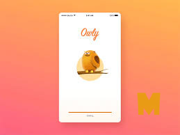
A splash screen is the first screen you see when you launch a mobile application. Basically, they were invented to conceal the loading process that software performs before getting fully ready, like with computer games intros.
A perfect splash screen design attracts the user’s interest with impressive illustrations, intriguing headlines, and additional components of an app UI just as the application silently gets ready behind this scene. In order to splash screens to be effective and not frustrate users, they should be shown for no more than 8 seconds.
Onboarding screen
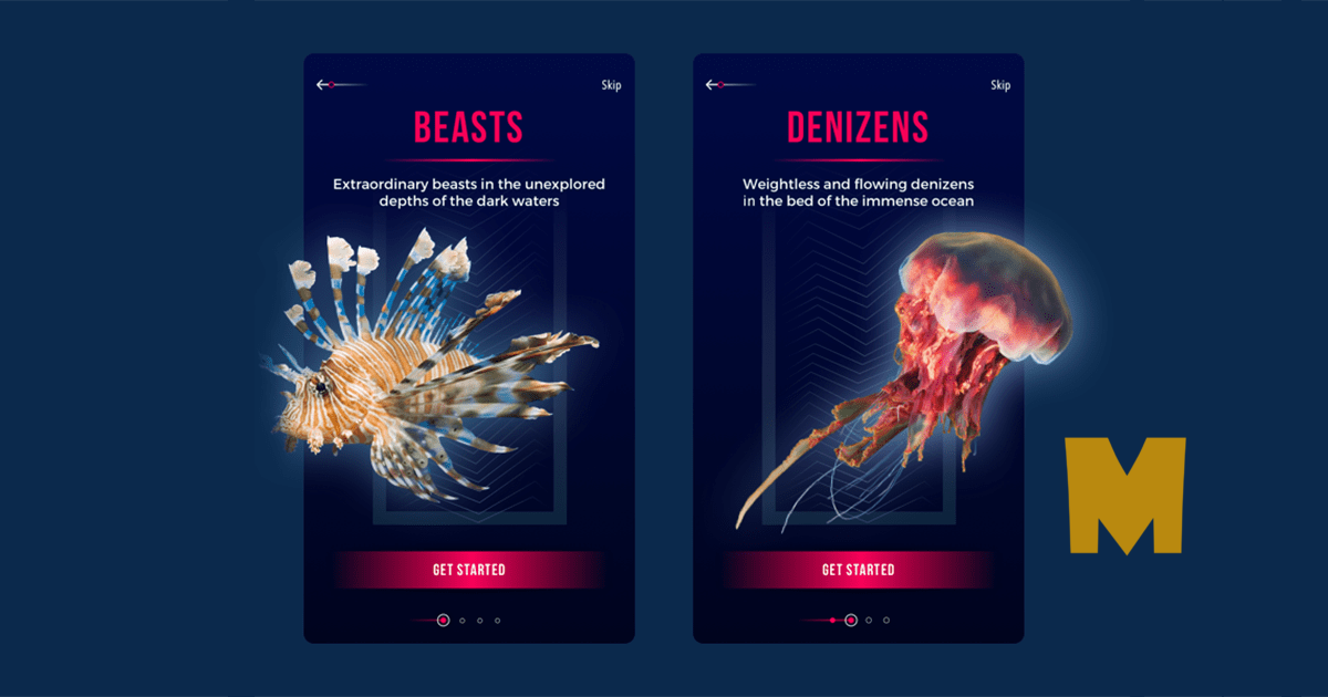
The onboarding screens are a collection of screens with a purpose to demonstrate a mobile app’s main features and benefits and lead users through its interface. Like with splash screens, some designers question the necessity of the onboarding, though, in reality, it might prove tricky for new users to straightaway correctly guess how to find their way through a new app, particularly if the interface is unfamiliar to them.
Though the form and text of an app onboarding depend on its purpose, all onboarding screens have some basic practices.
Home Screens
Home screens are the main window through which the users get access to the functionalities and the provided options. It should also reveal the concept of the brand and the purpose behind its products. Still, repeatedly, there exist some general components required in all home screens.
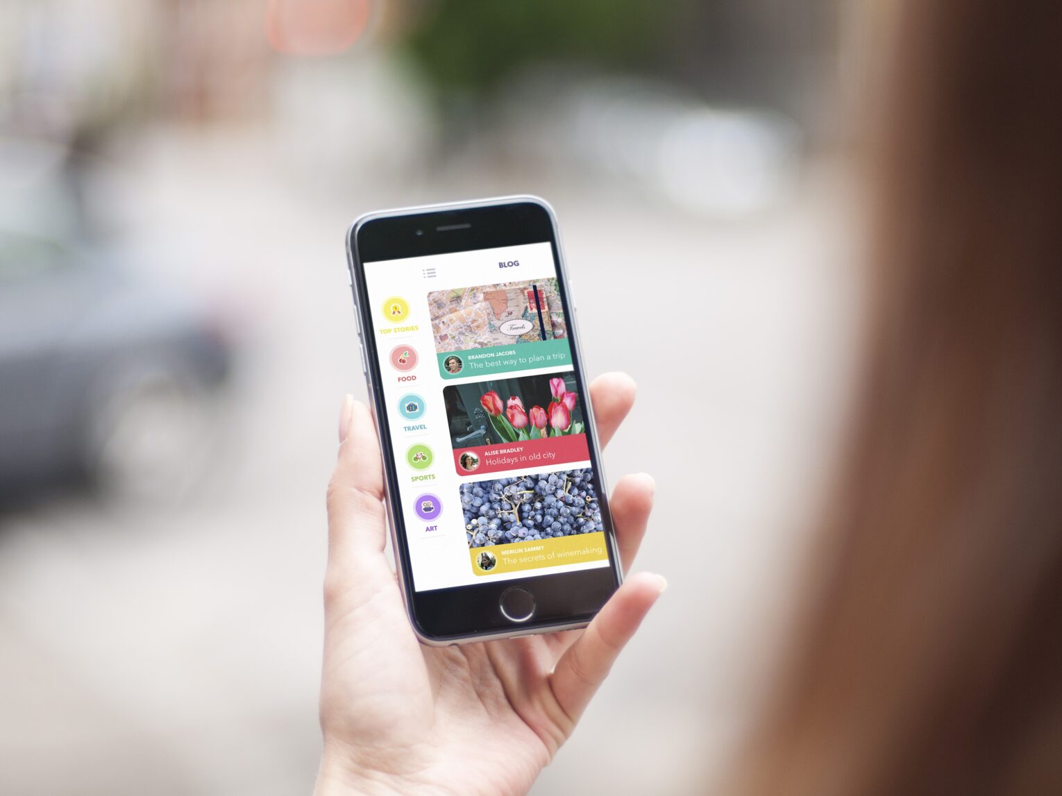
These embrace navigation elements and a search field that offer access to the functions and content part. Home screens are the beginning spot from where the journey of the user takes a start. If the app holds a lot to showcase, they could take in a menu, driving towards all the probabilities. But, remember that the list should allow not more than 7 categories to be more efficient.
Log-in Screens
Most apps now require users to create their accounts within them. A great trend in the design industry is making the log-in screens as clean and minimalist as possible so that users don’t feel annoyed for having to sign up a log-in and have easy access to their profiles.
Designers should provide maximal convenience when it comes to these actions. The amount of information required should be kept to a minimum. These screens should be designed with the targeted audience in mind. That’s why it’s best to follow the user research for the matter, to be sure they meet consumer’s needs.

Conversational Screen
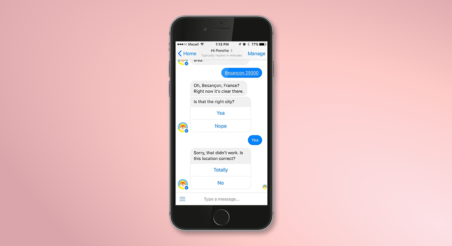
One of the most trending screens used these days in UI design is the conversational screen. The advent of AI and Machine Learning has paved paths for voice-controlled designs and chatbots. They are both intuitive and conversational and soon would they be the tool for catering to the requests made by users on mobile apps. Designing this has kept several UI designers awake all night, but it would be totally worth it if you get it right.

Stats Screen
Many mobile applications contain statistical information on various user activities, based on the app’s purpose.
Making good stats screen design can be a harder task than it seems simply due to the existence of the information overload problem rooting from the dominance of digital technologies when people get overwhelmed with loads of data on a daily basis.
So it’s a designer’s task to present the mobile app statistical information in the clearest and most usable way without any excess data.
Make the stats screen look appealing with a clear layout where all the charts and graphs neatly arranged with distinct icons and easily deciphered typography.

Creative Scrolling
This one is more of a technique, but it’s applied to scrolling screens seen in many apps. With social media ones, scrolling has become natural to consumers. However, designers could make it effective for enhanced user experience. The creative scrolling UI design could provide better usability and higher productivity.
This could be a parallax scrolling, which means background images throughout a web page move slower than foreground ones. The technique creates an illusion of depth on a two-dimensional site.
Calendar Screen
Everyone needs a calendar to be up to date on their professional as well as work life. This is why the calendar is one of the most important apps for a person with a smartphone. To-do list apps, event apps, and plenty of others offer users with a private calendar. Contingent upon the basic function of the app, the calendar could perform functions like sending timely reminders and scheduling meetings. The visual vogue must fit the mood and the objectives of the app to impress the user.

Music Screens
Playlist screen
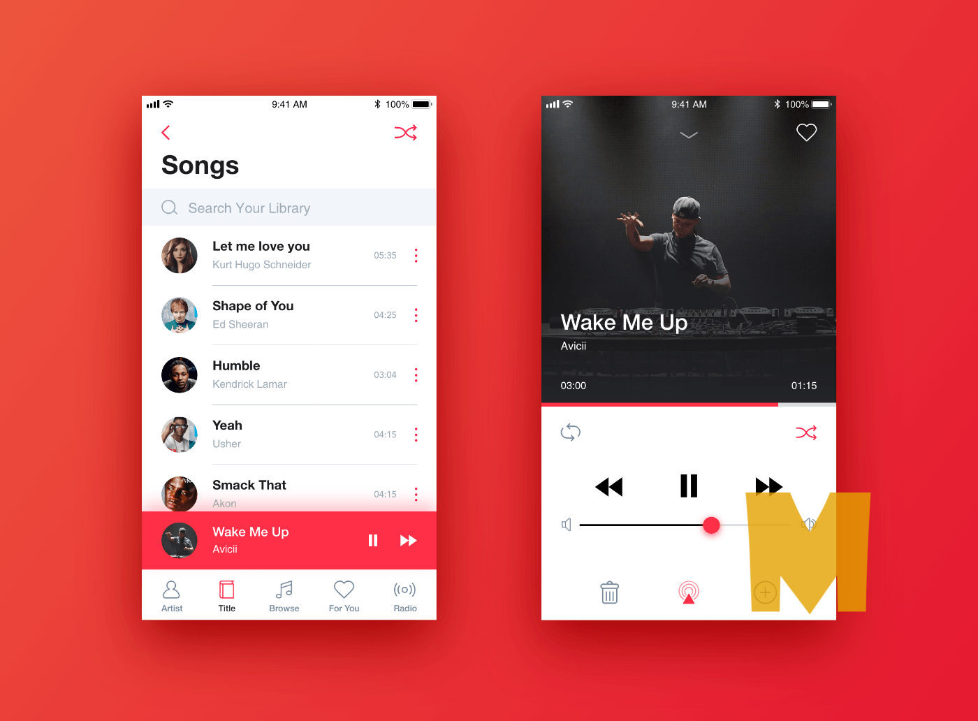
The integral feature of any music app is, of course, the ability to create custom playlists. The UI of playlist screens is usually similar on various apps, and rightfully so. Users expect certain features working a certain way. So it might be best not to reinvent the wheel but to follow the guidelines other designers have already formulated.
A music app playlist is a list of tracks showing the detailed data on the track. A small image representing the album can be added to each track.

Player Screen
A music app needs a player function with a standard and easily recognizable set of play, stop, switch buttons that are normally presented at the bottom of the screen. The central part is usually occupied with an album image or some sort of music visualizer. Sometimes designers add color gradients to some buttons and smaller sections. It makes people focus on these special parts and gives a sense of hierarchy.
E-commerce Screens
Catalog Screen
For an eCommerce app, you would need a catalog screen to display all the products in one place. The better the visual presentation, the more are the chances of the user buying the product. A designer’s job is to form the catalog that will attract a user’s attention and encourage them to shop for a product. You can offer the user to scroll through the list, just like several other eCommerce websites and apps display it. The amount of merchandise/products in one row can be decided according to the breadth of the screen.

Product Screen
After browsing through the catalog, a user chooses a particular item to their liking and proceeds to the product page. This is the step when they have a certain mental image of what they want to buy so they are interested in precise and clear product information to help them make a final decision. So it’s best for designers to remember that this is when a detailed specification of the product is needed, and provide enough space for it.
The central part of the product screen is most often a product image.

Check Out Screen
That’s the next imperative e-commerce screen. Before placing the order, it’s the last step. The designers should come out with this stage to be convenient, otherwise, the users could drop their filled cart and would never wish like finishing their order.
Regarding, the check-out screens, what’s most crucial is to be sure about the user’s experience that the data they offer is secure. Visual components, such as famous brands’ icons who offered their certificate and approval signs could be appended to assure that feeling.

Social Screens
Feeds screen
Social network apps are useful communication services for people with common interests. According to studies, smartphone owners on average actively use 9 applications on their devices, launching them up to 300 times a day. The ranking is dominated by instant messengers, games and online cards.

In the social apps feed is the constantly updated list of news and activities by the users you follow. People often quickly scroll feeds during brief breaks so the best option is to create a design without too much overloading visual details.
Contacts Screen
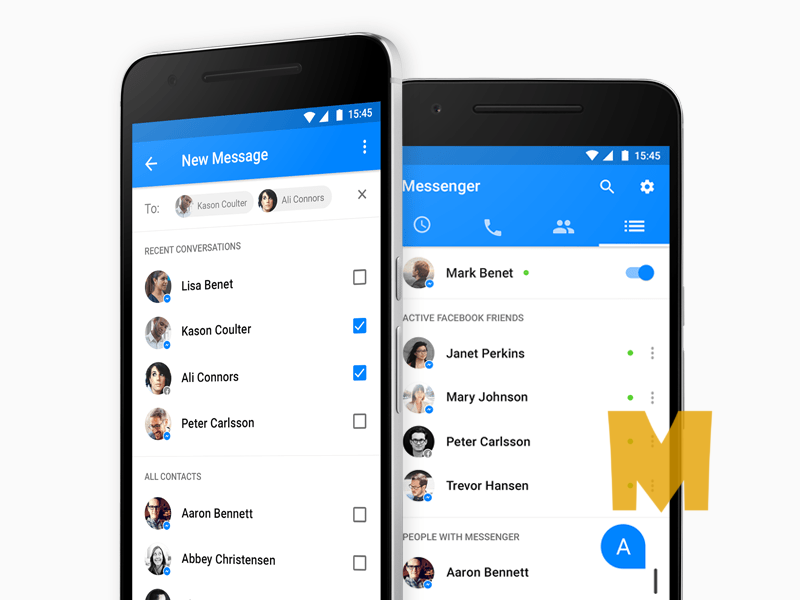
Communication involves users wanting to keep track of their friends and acquaintances within the app along with having their key contact data close at hand. Great contacts screen design lets users spend less time looking for their contacts and more time actually connecting with them.
Usually, the lists in mobile apps are alphabetically ordered. Each separate contact is accompanied by a small photo and upon clicking leads to detailed information with email, phone number, etc.
Final Thought
A great UI design is a perfect combination of beauty and proper graphics. Graphics help users understand and visualize the meaning of any particular button or text. This attracts more users to utilize the app, thus resulting in more downloads and positive reviews.
Nowadays, loads of mobile applications appear, so they bring new types of screens for fresh requirements users bring out. Designers should be ready to take this challenge and always follow innovations. Get inspired!


