Introduction
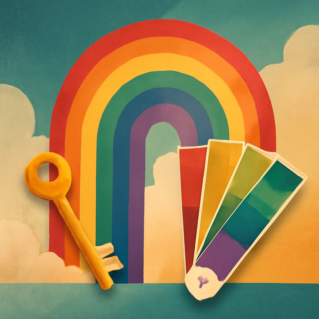
Color is a powerful tool in design, capable of evoking emotions, conveying messages, and influencing perceptions. ‘Unlock the Rainbow’ explores how to craft effective color palettes that inspire creativity and enhance your design projects. Understanding color theory and its application is essential for designers looking to inject life and vibrancy into their work.
Unlocking the rainbow can transform your design projects by offering vibrant and harmonious color palette concepts. Whether you’re looking to refresh your brand identity or enhance marketing materials, understanding color interactions is essential. For example, you can showcase your brand with tri-folds to effectively communicate your message while captivating your audience’s attention: showcase your brand with tri-folds.
The Role of Color in Design
Colors go beyond aesthetics; they’re integral to visual storytelling and brand identity. A well-chosen palette guides the viewer’s experience and influences their emotional response.
- Emotional Impact: Colors can evoke feelings such as excitement, calm, or urgency.
- Brand Recognition: Consistent use of color reinforces brand identity and recall.
- Visual Hierarchy: Colors help create focus and guide user interaction.
Understanding Color Theory
Color theory is the framework that informs how colors look together. A designer’s grasp of color theory ensures cohesive and effective palettes.
- Primary Colors: Red, blue, and yellow are the foundation of the color wheel.
- Secondary Colors: Green, orange, and purple result from mixing primary colors.
- Tertiary Colors: These are blends of primary and secondary colors, like teal or magenta.
Creating Effective Color Palettes
Effective color palettes consider contrast, harmony, and audience perception. Whether designing a website, packaging, or marketing campaign, thoughtful color choices can elevate a project.
- Monochromatic: Variations of a single hue create a cohesive look, perfect for minimalist designs.
- Analogous: Colors adjacent on the color wheel offer harmony and variety.
- Complementary: Opposite colors provide high contrast and energy.
Examples of Inspiring Palettes
| Type | Description | Examples |
|---|---|---|
| Monochromatic | Single color with varying shades | Blue and light blues |
| Analogous | Colors next to each other on the wheel | Green, yellow-green, yellow |
| Complementary | Colors directly opposite on the wheel | Red and green |
| Triadic | Three colors evenly spaced | Red, yellow, blue |
Tools for Palette Creation
Using tools like Adobe Color, Color Hunt, or Paletton, designers can experiment with and generate harmonious color schemes. These resources simplify the selection process and inspire creativity.
FAQ
How does color affect branding?
Color significantly influences brand perception and memorability, making it crucial for identity design.
What’s the best way to choose a color palette?
Start with the brand’s personality, consider the target audience, and apply color theory for cohesive results.
Can colors influence emotions?
Yes, colors can elicit emotional responses; for example, red can create a sense of urgency, while blue promotes calmness.
Is there a universal color that suits all designs?
No single color fits all designs; choices should align with the brand’s message and the project’s goals.
How important are cultural differences in color perception?
Cultural context can shape color interpretation, so it’s essential to consider the audience’s cultural background in global projects.
Are there any color trends in 2025?
Eco-friendly ‘green’ palettes and digital-inspired neon colors are gaining popularity in 2025, reflecting sustainability and technological growth.
Conclusion
Color palette creation is an art that requires understanding of color theory, audience, and cultural implications. By unlocking the rainbow in your designs, you can create impactful visual narratives that resonate with your audience. Whether you’re developing a new brand identity or refreshing a product line, inspiration can be found in the limitless combinations of the color spectrum.


