A website header is the first thing that visitors see when they visit a site, and it appears on every page of the site. A good website header balances clean design and crystal-clear navigation to the deeper pages of a website. As such, it’s important to concentrate on best practices to design a website header for your clients that helps their customers quickly get to the information they need.
A well-designed website header is crucial for user experience and can significantly impact navigation and accessibility. Key best practices include utilizing a clean layout, ensuring clear branding, and optimizing for mobile devices. For design inspiration, consider tools that can help visualize your ideas like download free coaster mockups.
Your profile is your virtual storefront, the”face” of your business on the Web. Your Profile Design Johor Bahru enables you to share information about yourself and your business with Web buyers, and it’s full of helpful information in its own right. If you’re a new seller, you’ll find tips here on how to boost your sales volume. If you’re a long-time seller, you can refresh your selling strategy by reviewing the information and links available here.

What is a header?
In web page layout, the header is the upper (top) part of the web page. It is definitely a strategic part of the page as the area which people see before scrolling the page in the first seconds of introduction to the website. Being somehow a sign of invitation, the header should provide the core information about the digital product so that users could scan it in split seconds. In the design perspective, the header is also the area making the broad field for creative design solutions that should be catchy, concise, and useful.
WHAT SHOULD BE IN THE HEADER?
Website header design should always include:
- Your company logo – Make sure it follows your brand guidelines and is responsive to how the page scrolls. There’s nothing worse than a navy blue logo on a black background.
- Navigation – This is a loaded topic. More on it coming up!
- CTA/conversion tactic – Making this prominent will increase the likelihood of your website visitors taking action, like contacting you, ordering samples or finding their local sales representative.
- Your phone number – And make sure it’s trackable! If you want customers to actually call you, make sure they can see it as soon as they land on your website.

Why are Headers important?
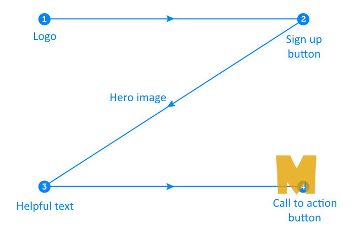
People scan or read through information differently, so businesses need to choose a header design pattern that allows their users to absorb their content the way they intended it to. The three most common models are as follows:
- F-pattern. Typically used on websites that display blocks of content (e.g. blogs and search results pages.)
- Z-pattern. Designed for websites with minimal copy and where simplicity is their main priority.
- Gutenberg diagram. Applied to pages with text-heavy content. It also describes the general pattern on how the eyes move when looking at evenly distributed information.


DESIGN PROCESS
Highlight the Important Elements
The header must contain meaningful information about the brand. This way, users will have an idea of what type of website the business is running, allowing them to scroll through each page with a clear goal in mind.
Make it Visually Appealing
Making a visually appealing header doesn’t necessarily mean to add every stunning icon, photo, or effects on the website. Sometimes, the simplest and cleanest options are enough to keep the header engaging.

Choose a Good Font
The font does matter! Or fonts, we suggest using at least two for good topographic contrast and visual interest. You the font choices that are clear to read and work with the overall brand identity you are trying to craft.
Use Hamburger for small screens
The shrinking header is a great way of minimizing the amount of space headers take when users scroll while keeping key site information accessible. They are particularly handy if you’ve designed a really big, impactful header. The shrinking header can show primary navigation elements and the logo, and change color as users scroll.

Sticky Header & Navigation
When landing on the homepage, the visitor should see the biggest version of your header, including the navigation. This is because they might be new to your website and will need as much information at first glance as possible.
But as they scroll down, the header should still be visible in its most truncated format. This is so the other sections of your homepage don’t disappear if the user hovers over the navigation.
Conclusion
The header is an integral part of a website, so businesses should take the time to create a header that’s attractive and practical for their users. User research can provide a good basis for the design solutions which can follow quite traditional forms of header organization or require a totally new perspective.


