Color theory which comprises the basic techniques of picking a matching color series. The colors you choose when designing your website can convey different thoughts and emotions about your brand, so it’s imperative you choose the right colors for your brand. Knowing the effects color has on a majority of people is an incredibly valuable expertise that designers can master and offer to their clients.
Understanding the psychology of color is crucial for designers, as colors evoke emotions and influence perceptions. This guide explores how different colors can be leveraged in design to create powerful visual communication. For practical application, consider using custom banner templates that showcase these principles.
The Purpose of Color
The purpose of color is to deliver a more impactful experience to the viewer. Websites could be designed completely in black and white just like a graphite pencil drawing. But there would be a lot of missing information, emotionally and tonally. In fact there are plenty of black and white websites online, but most of them are minimalist and simplified.
Adding color into a layout provides a richer canvas for expression. Graphics, fonts, buttons, hyperlinks, everything can be styled in a way to match an overarching tone.
Why Is Color Theory Important in Web Design?
Color is an important aspect, if not the most important aspect of design, and can influence the meaning of text, how users move around a particular layout, and what they feel as they do so. By understanding color theory, you can be more intentional in creating visuals that make an impact.
The Color Wheel
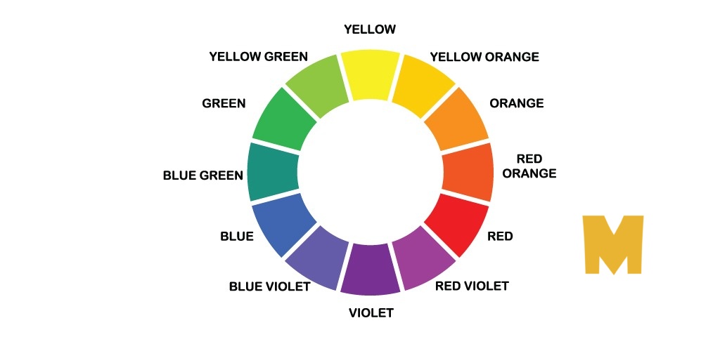
You’ve probably seen a color wheel in your art classes, or remember the famous acronym “Roy G. Biv” to remember each color of the rainbow. The color wheel is an illustrative diagram that shows 12 colors around a circle, used to represent each color’s relationship to one another. Colors arranged opposite each other are complementary to one another. Colors located near other colors share common characteristics and often pair well together.

Primary Colors
Primary colors are the “original” colors, consisting of red, yellow, and blue. You can’t mix any colors together to get these colors.

Secondary Colors
Secondary colors are formed from an equal mixture of two separate primary colors. Yellow and blue mix to create green, yellow and red mix to create orange, and blue and red mix to create violet.

Tertiary Colors
Tertiary colors are created by combining adjacent primary and secondary hues. For example, a primary color, such as yellow, and a secondary color, such as green, mix to create yellow-green.

Additive & Subtractive Color Theory
If you’ve ever played around with color on any computer program, you’ve probably seen a module that listed RGB or CMYK colors with some numbers next to the letters.
CMYK
CMYK stands for Cyan, Magenta, Yellow, Key (Black). Those also happen to be the colors listed on your ink cartridges for your printer. That’s no coincidence.
CMYK is the subtractive color model. It’s called that because you have to subtract colors to get to white.

RGB
RGB color models, on the other hand, are designed for electronic displays, including computers.
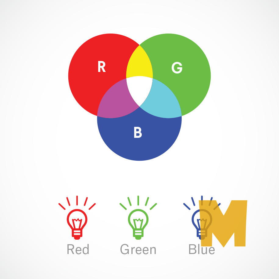
RGB stands for Red, Green, Blue, and is based on the additive color model of light waves. This means, the more color you add, the closer you get towards white. For computers, RGB is created using scales from 0 to 255. So, black would be R=0, G=0, and B=0. White would be R=255, G=255, and B=255.
Color Schemes
Using the color wheel you can make any color scheme or combination, but some will look better than others. Just as colors mix to create new colors, colors can be paired to create visually pleasing combinations.
Monochromatic Colors

Monochromatic color schemes focus on a single color, often using variations of that hue by incorporating tints, tones, and shades. It might sound like a boring palette, but this provides variations in value that add interest and dimension to your composition.
This color scheme is extremely versatile and easy on the eye. Using many hues in a design can often overwhelm the viewer and obstruct the design’s tone, but subtle color variations on one hue help to simplify a design without making it too flat.
Complementary Colors
Complementary colors are opposite on the color wheel and typically produce a lot of contrast. For example purple icons on a yellow background should stand out with a certain vibrancy expected of high-contrast matching. Naturally this would depend on the level of saturation in each color which is best understood through practice. Just remember: opposites contrast!

Analogous Colors
Analogous colors are located right next to each other on the color wheel. It should be apparent this color scheme does not produce a high level of contrast. But it’s still useful when designing graphics, banners, textures, or backgrounds that need to match throughout a webpage.
Split-Complementary Colors
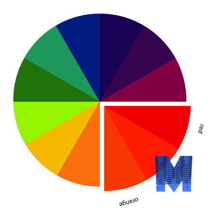
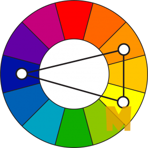
Split-complementary color schemes might look similar to complementary schemes, but this combination incorporates the two neighboring hues of a color’s complement
Double Complementary (Tetradic) Colors
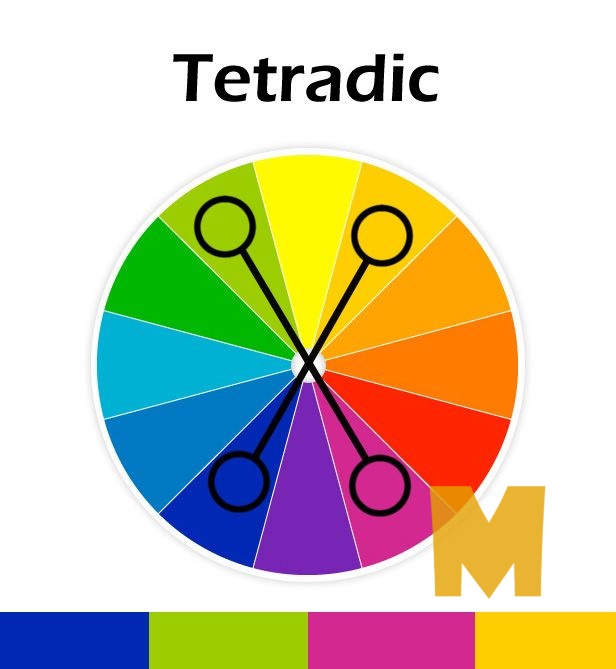
Complementary colors are already intense in nature; double complementary, or tetradic, color schemes up the ante by using two pairs of complements. To keep a balanced composition, choose a dominant color and lower the saturation or intensity of the other hues.
Triadic colors
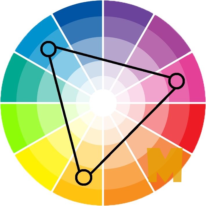
Triadic colors are three separate colors which are equidistant apart on the color wheel. When toying with this color scheme, it’s important to let one color be more dominant than the others. Balance is achieved by working with the colors to decide how they should fit into the overall layout. Saturation plays a role, but still doesn’t change much regarding the overall color scheme pattern.
